http://www.austinkleon.com/2011/03/30/how-to-steal-like-an-artist-and-9-other-things-nobody-told-me/

Ah from studio shelter on Vimeo.
Fog City Mavericks - Part 1 of 5 from Gary Leva on Vimeo.
Fog City Mavericks - Part 2 of 5 from Gary Leva on Vimeo.
Fog City Mavericks - Part 3 of 5 from Gary Leva on Vimeo.
Fog City Mavericks - Part 4 of 5 from Gary Leva on Vimeo.
Fog City Mavericks - Part 5 of 5 from Gary Leva on Vimeo.
Found @ On Animation
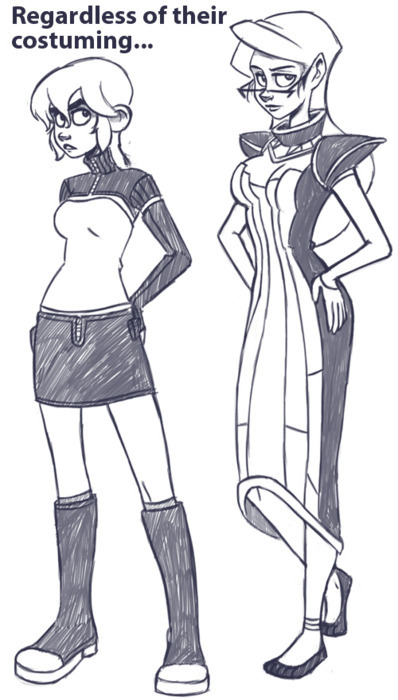
Continued from the last article about costume design, today we’re going to talk about those wacky things you hide underneath clothing. Figure drawing is a pivotal tool to any artist, but being able to effectively render humans and creatures is only part of the equation. Even if your draftsmanship is solid, you won’t get far if your designs are uninteresting. Effective and dynamic figures are the cornerstone of having compelling characters in pretty much any comic.
The focus of art in general is to generate a particular response out of your audience; the mechanics of what you literally create are often secondary to this goal. Something can be abstract or literal, but the point in both cases is the effect is has on the viewer/listener/reader; the creation itself is a means to an end. In comics, authenticity and realism are not defined by what you are actually drawing, but rather how your drawings are viewed by your reader. In the context of a visual narrative, a simplistic drawing can be “more real” than a more realistically rendered one if that simplistic drawing evokes a more authentic response. A stickman can be a more convincing character than a photorealistic painting; it all depends on how that stickman is conveyed.
When you design your characters, you have an opportunity to both communicate information about them, as well as provide a conduit through which information about other characters and even environments can be shown. Their appearances can augment the actions in the narrative, or even take the place of regular action.
When designing characters for comics, then, it’s not universally important to faithfully recreate how people look in real life or even caricature real life. This may sound contentious at first glance. After all, isn’t a big part of cartooning exaggerating elements of real life? Certainly, but that’s only half of the equation when it comes to visual narratives. A regular caricature is mostly about emphasizing what’s visually obvious, and while that’s still present in comics and animation, on top of that there’s often the need to convey information about the character. Even if you’re basing a design on a real person, what you choose to emphasize can determine how the audience views that character. Again, what part of “reality” (in this case people’s appearances) you select to share can profoundly change how those characters are perceived.
While they can be very similar, a fundamental difference between the needs of comic design versus animation design is the presence of literal motion.
In animation you can give your character a nervous tick, a particular walking pattern, or any other number of facial and other motion cues to add flavor and depth to a character. However, with the static images of comics, this approach is limited. As such, more pressure is placed upon the designs themselves because they’re the primary visual resource the reader has for gaining information about the character. Luckily, there’s a plethora of tools at our disposal for doing just that. The shape, size and position of a figure can be designed in such a way that it implies motion. Upturned brows and lips can suggest someone who is frequently bemused, an exaggerated posture can give the impression of a certain type of gait, and so on. And since the reader’s eye can dwell on a comic panel indefinitely (at least in theory), there’s more freedom to employ subtler facial and body elements to add to a character’s flavor.

Silhouettes and overall shape are the first pieces of information to reach the reader, and because of this they will always dominate any character’s design. If your silhouette isn’t doing its job, the rest won’t matter. Starting with a simple, clear shape and working backwards is a good rule of thumb. And while this is naturally easier with monsters and other fantastical creatures, it applies just as much to regular people.
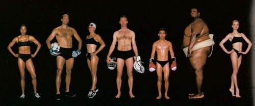
People are not divided into skinny/fat/muscular. While these body states do obviously exist, each of these will still differ from person to person. For example, there’s not a single “athletic” body type, but dozens (as this amazing photo series shows). Don’t fall into the trap of old superhero comics where everyone looks like a bunch of clones wearing different costumes. People’s builds, postures, hands, feet and musculatures are extremely diverse, going far beyond simple factors like age, height and weight.
Your character’s motions can inform you quite a bit on how you could design their form. If a character often stoops or shuffles, you can warp his or her spine and posture to bring attention to that sort of behavior. In general, you want the figure to emphasize and accentuate the type of body language indicative of that person. This is really important. In animation, there’s a little less of a required connection between body language and design because you can literally show motion, but with comics being a static medium, you have to imply a lot of motion without showing it. Naturally, if your character has a very wide range of motion, your design should reflect that too. Main characters aren’t usually designed around a single posture, for example, but side ones often are. In the end, this is all a tool to efficiently communicate information about a character to the audience.
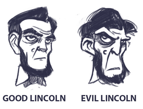
Even more so than with the body, you should be able to reduce each character’s head to a fairly recognizable shape. This is the foundation for developing a good head silhouette, which is vital because the focus of a page is often on peoples’ faces; recognition should be established on a subconscious level with little to no effort on the part of the reader.
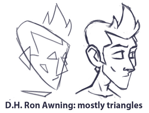
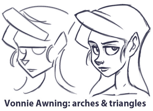

If the reader can’t immediately and clearly distinguish who is who without using details, the designs are bad. Also note: using hair alone to distinguish heads is cheating. Similar to the superhero body problem, don’t fall into the crappy anime trap of having identical heads that are only distinguishable by their wacky hair. Obviously hair is a component of character design, but to rely exclusively on it is taking a shortcut that only ends in sloppy composition and no variety.
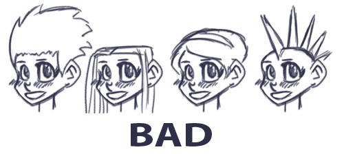
Similar to the Naked Test (which we’ll talk more about shortly), you should be able to immediately distinguish all your character’s heads without any adornments or hair. Shave ‘em down and compare.
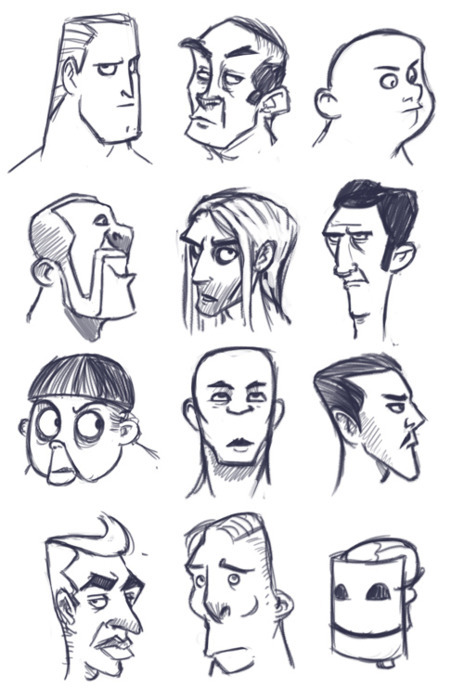
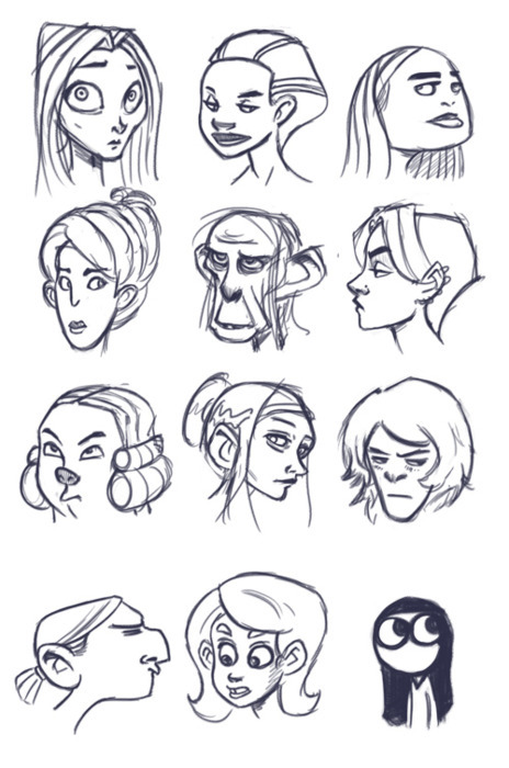
Ears, eyebrows, skulls, eyes, eyelids, noses, cheekbones, nostrils, hairlines, necks- these are all elements that will vary from person to person. Don’t be afraid to go beyond normal human proportions. Exaggerating or simplifying to the point of even being a stickman is perfectly fine, so long as it suits what you’re trying to do.
What types of facial expressions and body language do your characters exhibit? Main characters generally require more of a range than side characters, while less three-dimensional characters can be designed to fit only a handful of expressions. 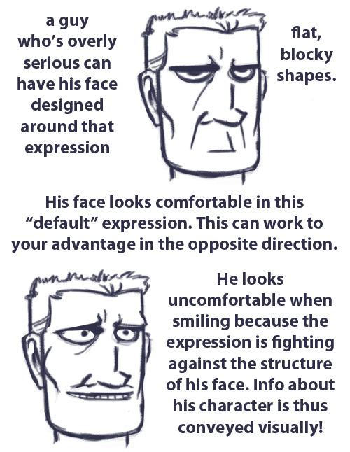
A lot of character information can be shown to the audience this way. Showing rather than telling your readers means you’re playing to the medium’s strengths.
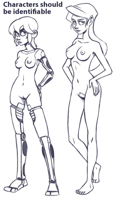
Once you’ve designed your figures, we move on to the Naked Test. When developing a cast or even just a couple of characters, they should always be instantly recognizable without the aid of clothing. Even if their clothes have some key distinguishing elements to them (which they probably should), the bodies themselves are the foundation, and if the foundation is too generic, then you’re left with a flat design that can’t be corrected by adding stuff on top. All the basics should be present at this level: distinguishable silhouettes, unique body types and proportions, and unique facial shapes should all be there to tell your character’s story.
Figure drawing isn’t easy. Because we’re hard-wired to distinguish even the tiniest variance in human appearance, there’s a lot of pressure to get figures right compared to other subjects. As such, it’s easy to play it safe with conservative designs that don’t strain our draw-muscles, but it’s important to push past that. Effective and compelling character design is a skill that’s indispensable for cartooning of every kind.